What are the Best/Funniest/Weirdest/Worst illustrations you have seen? (Include illustration if possible)
You must log in or register to comment.
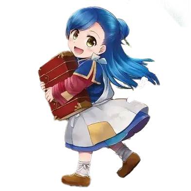
Okay, worst illustrations… I’m still annoyed by how bad this illustration was in Ascendance of a Bookworm.

Style-wise, there’s nothing wrong with it. The rendering is fine and the proportions are all right. What I dislike is how… AWKWARD it is. And not in a “oh, Myne’s feeling awkward” but more like just how awkwardly it’s drawn. Myne’s breaking the fourth wall and staring at the reader. Lutz is behind her instead of on the other side of the pot where he would normally be if he was, you know, actually helping. This is clearly a case of the artist just drawing something as described rather than trying to capture a moment of the story in time.
Compare that to Llo, who I think EXCELS at capturing story moments in time.


There’s so much movement in a still picture. It’s so dynamic you almost feel like you’re there watching it yourself. And even in slower moments there’s incredible amounts of emotion.


Llo’s use of the split-screen is fantastic. It allows you to get multiple perspectives in a single image without it ever feeling forced or awkward. Just, absolute next level stuff.
I’d also like to talk about KWKM. Their art is fantastically detailed with very unique embelishments that I don’t normally see in fantasy-style art.

I used this photo before when we were promoting our pics for the 2024 awards but I want to bring it up again. It’s just so detailed with amazing highlighting and tone. Frequently an artist who is good at B&W fails to adequately do color well but that’s not the case with KWKM. Their art is so detailed and just breathtaking. Speaking of B&W art, they also shine there as well.

Just all-around great art. Although it’s very clear that their strength is in drawing people since very little of their art depicts scenery. Here’s another good color spread:

Anyway, those are all pretty big publications with A-tier artists so I’d also like to talk about some more indie novels. One of my favorite indie LNs is The False Hero and the author uses art from a variety of sources. The main artist who does the covers is actually pretty good. Sure, it’s not Llo amazing, but I’d say it’s better than 95% of the art in other indie novels.


The issue is that Unholysoul27 doesn’t do all the art in the book. My guess is their commission prices are higher than others so they’re reserved for covers and the best color inserts. But seriously, that second piece of art… amazing. There’s a lot going on in the story at that moment and it depicts it so subtly that I STILL think about that piece of art long after I’ve finished reading the book.
BUUUUUT then there are other artists that contribute to the book and their styles don’t always mesh with Unholysoul27. Take this for instance:

She looks absolutely derpy and nothing like the character depicted in the text (who is a sulty tsundere vampire). For reference: this is the same character:

and this:

And it doesn’t get any better from there. These next images all depict the same character:


Now you might be thinking “well, it’s definitely a mis-match of styles but overall the quality is pretty good.” But then they throw in some low-tier art like this:

You might notice that every image I’ve linked as been in color. And that’s because every image in the novels IS in color! That’s one thing I actually do enjoy. Like I said, this is still one of my favorite LNs, and probably my favorite from an indie author.
Now for some really pathetic art. Lets talk about The Anime Trope System. This is trash LN at its finest. The author basically decided to parody every trope from Japanese LNs and put it in one series and it’s actually pretty hilarious. You have OP characters. You have stupid amounts of power creep. You have children’s card games. You have a MASSIVE harem of like 20+ girls (all but 1 who were virgins before meeting the MC) that doesn’t feel stupidly awkward and doesn’t devolve into orgies and all the people fighting for sexy time. Seriously, it’s one of the best written harems I’ve seen… and it’s a PARODY! Anyway, this isn’t about the story but the art. The books don’t really have any art outside of the covers but the author decided to change artists mid-way through the series and OMG did the cover art get so much worse.
Here’s the art for the first couple novels. Each basically depicts a new character being introduced (who inevitably becomes part of the harem)


It’s cute and it does a VERY good job at showing us what these characters look like.
Then the artist changes and we get… whatever this is:


Then afterwards it becomes a rollercoaster as each cover is done by a different artist. Sometimes they’re good, sometimes they’re awful. Here’s a better one.

A similar thing happens with Rise of the Weakest Summoner except the juxtapositionis SO much worse. At least with Anime Trope System they’re all in an anime style. Not so here. This is the cover of book 1:

This is the EXACT SAME CHARCTER on the cover of book 7

Anyway… I’ve droned on long enough. Enjoy the art.
Thanks for the little excurse into the indie LN scene. That’s something completely unknown to me. But yes, I agree, some of those illustrations are terrible, especially when they are supposed to be the same characters.
Your second Fran/Teacher example there is actually something I dislike a lot when artists do that. I see it as a copout. It’s just a generic “here is character swinging a sword with some effects”. It’s like the transformation scene in a magical girl anime. It is so generic that it can be sliced in everywhere. There is no background, there is no enemy, there is no special expression, and there is literally nothing unique to the scene. Every single time I see this type of illustration I’m disappointed that I don’t get the see the monster/enemy design.
As for the awkward Bookworm illustration, I think that almost none of the illustrations in that series are like frame captures from a movie scene. It’s almost always a composition that shows the characters/their expressions/the object/the place/etc. that’s the focus of the scene. I like this approach since it gives me the information I want. Take this illustration for example in direct contrast to the Fran one I talked about earlier:
Spoiler from P2V4

Instead of just a picture of Myne using her magic like Fran swinging Teacher, we see the people behind her, their and Myne’s expressions, the enemy they are fighting, his expression and Ferdinand swooping in to save the day all in one illustration. It’s everything important in that given scene. The only thing that could be better would be showing off some of the background as well.
Take this illustration for example in direct contrast to the Fran one I talked about earlier
Oh, that’s definitely a good illustration and even uses that “split screen” stuff I’m so fond of. I’m not going to argue that all the bookworm illustrations are bad because they’re obviously not. Just that one in particular stood out to me as just feeling so wrong and out of place. L2 brought up this image and while it is definitely of the composition variety it doesn’t feel nearly as awkward, probably because there’s no fourth wall break and everyone is standing in roughly an acceptable spot

Your second Fran/Teacher example there is actually something I dislike a lot when artists do that.
It’s interesting because I specifically picked that image BECAUSE it was more generic, just to show that even Llo’s generic renderings are well done IMHO. But if we want to talk about scenes which include an enemy, there’s plenty of good examples too
Minor Spoilers (Depiction of Enemies)
This is sword vs sword and I love the depiction and just how DIFFERENT the two are:

Here, Llo could’ve just drawn the enemy and left it at that, but they also put Teacher’s reaction in there, which makes the art just that much better.

Finally, a more generic “battle” scene but you can get the scale of tiny Fran fighting this big Ogre of a person.

And now that you mention the “composition” style of art, Llo also has a good share of that as well.

I like this approach since it gives me the information I want.
I think this just goes to show how insanely bad some of the indie art is, especially on Anime Trope System. It’s so bad that even I couldn’t tell you which characters are depicted on the covers. I’d rather have the Solo-Leveling cover art where it’s just just pretending to be a leather book than the horrible mess of characters depicted on those covers.

With all your examples back to back, I think I can pinpoint now why the Reincarnated as a Sword illustrations fell so flat for me. It’s the lack of expressions. You have an inanimate object and an expressionless girl, so it’s to be expected, but the only illustration I liked from the ones you posted was the last one at the table while eating. and on the flip side it’s probably why I cherish the Bookworm ones so much because there is always such a high emphasis on the character’s expressions.
I’d rather have the Solo-Leveling cover art …
I have always found the Solo Leveling covers to be strange for a series based on source material, where the visuals play the most important role.
It’s not the worst, but defiantly the worst choice - So I’m a spider so what Volume 16
It’s the end of the series, the big fight to decide the world future is happening. And instead of any of the fighting they choose…

We could have had White as a maid or the demon Lord fighting against a god. But instead we had that.
Ascendance of a Bookworm has some great illustrations.
When no one likes your new outfit. (Part 3 - Volume 2)

When you are the only one not getting it. (Part 3 - Volume 3)

Making Magic also has some good illustrations
There’s 2 types of people…

That one friend who’s always happy to see you

@NineSwords@ani.social the masochist reading more trash
We could have had White as a maid or the demon Lord fighting against a god. But instead we had that.
I hate it when something like this happens. I don’t know how significant this scene is but usually the illustration contingent gets used up for bath scenes that could be more impactful scene choices.
@NineSwords@ani.social the masochist reading more trash
That expression is spot on. The dead eyes. Just add some drool from all the brain cells dying.
I have one for “worst”. The illustrations for the Wortenia War series are so bad compared to other published series.

And for best I think so-bin’s work on Overlord is outstanding from the rest.

The Overlord illustrations can also be my pick for “weirdest”:

For the funniest illustration, I clearly remember an illustration of Rozemyne driving -proud as can be- in her highbeast through the castle halls with either Ferdinand or one of her retainers walking beside it with an exasperated expression. I am just not sure if this is really an illustration or if I only imagined how a scene from the books would look illustrated.
I clearly remember an illustration of Rozemyne driving -proud as can be- in her highbeast through the castle halls with either Ferdinand or one of her retainers walking beside it with an exasperated expression.
This one? Ascendance of a Bookworm - Part 3 Volume 1

Not how I remember it but that must be what this imaginary illustration of mine was based on. Thanks for finding it!
Yeah, I’m currently reading those volumes and there’s no depiction of her in the highbeast in the castle. There’s not even a depiction of anyone actually INSIDE her highbeast anywhere. What l2 showed is the closest.
There’s not even a depiction of anyone actually INSIDE her highbeast anywhere.
Sports Grun Version


Grunbus Version

Oh neat! I guess I haven’t gotten to that part yet. I love how she kept the huge tail after Ferdinand told her to make it smaller because it was a waste of mana XD